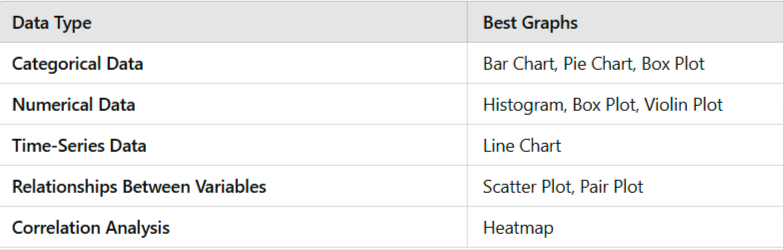
Data visualization is essential for understanding trends, patterns, and relationships in data. Choosing the right type of graph depends on the data type and the insights you want to derive. Below are the most commonly used types of graphs in data visualization:
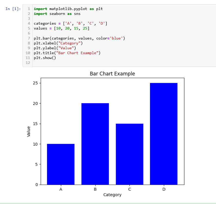
1️⃣ Bar Chart (Categorical Data)
Best for: Comparing categories or discrete groups
Example: Sales by region, number of students in different courses
Python Example (Matplotlib & Seaborn):
Variations of Bar Charts:
- Grouped Bar Chart: Compare multiple variables within each category.
- Stacked Bar Chart: Show proportions within each category.
- Horizontal Bar Chart: Useful when dealing with long category names.
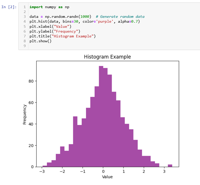
2️⃣ Histogram (Numerical Data Distribution)
Best for: Understanding the distribution of numerical data
Example: Exam scores, age distribution of customers
Python Example:
Shows skewness, spread, and data distribution
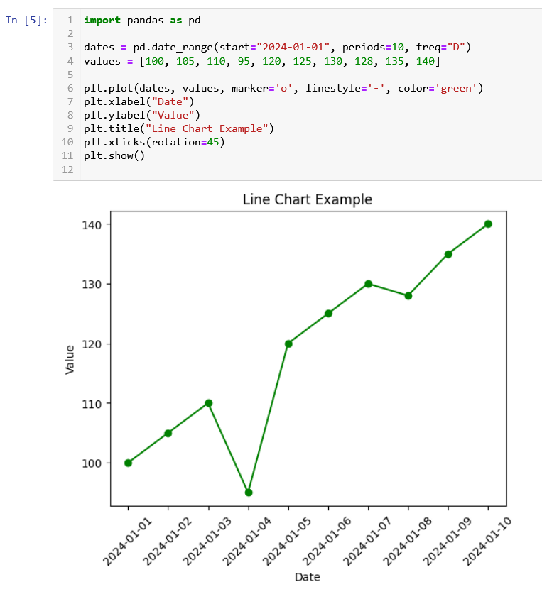
3️⃣ Line Chart (Trends Over Time)
Best for: Time-series analysis
Example: Stock prices, website traffic over time
Python Example:
Best for detecting trends and seasonality
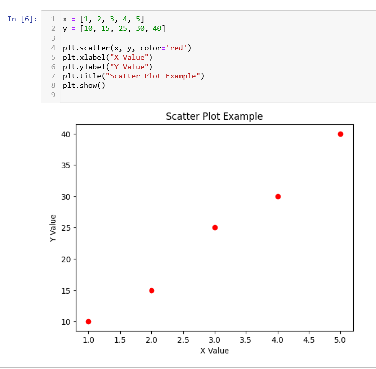
4️⃣ Scatter Plot (Numerical Relationships)
Best for: Showing relationships between two numerical variables
Example: Height vs. weight, advertising spend vs. revenue
Python Example:
Detects correlations, clusters, and outliers
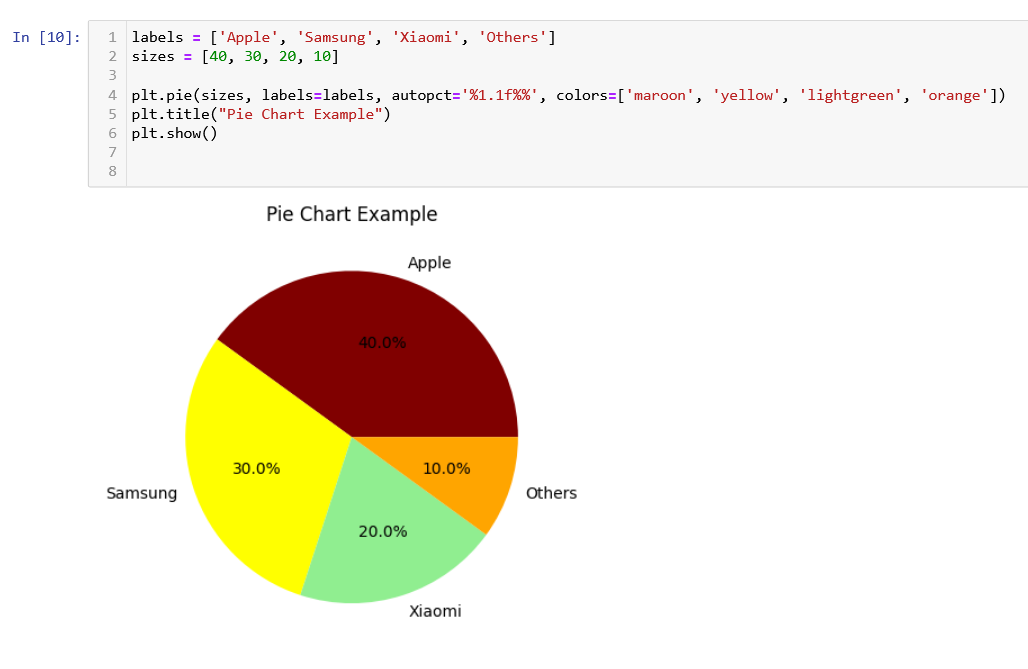
5️⃣ Pie Chart (Proportions & Percentages)
Best for: Showing the composition of a whole
Example: Market share of different companies, budget allocation
Python Example:
Use sparingly, as bar charts are often better for comparisons
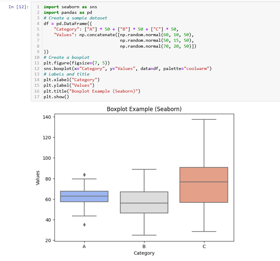
6️⃣ Box Plot (Outliers & Distribution Summary)
Best for: Identifying outliers and comparing distributions
Example: Comparing salaries across job roles, exam score distributions
Python Example (Seaborn):
Great for showing median, quartiles, and outliers
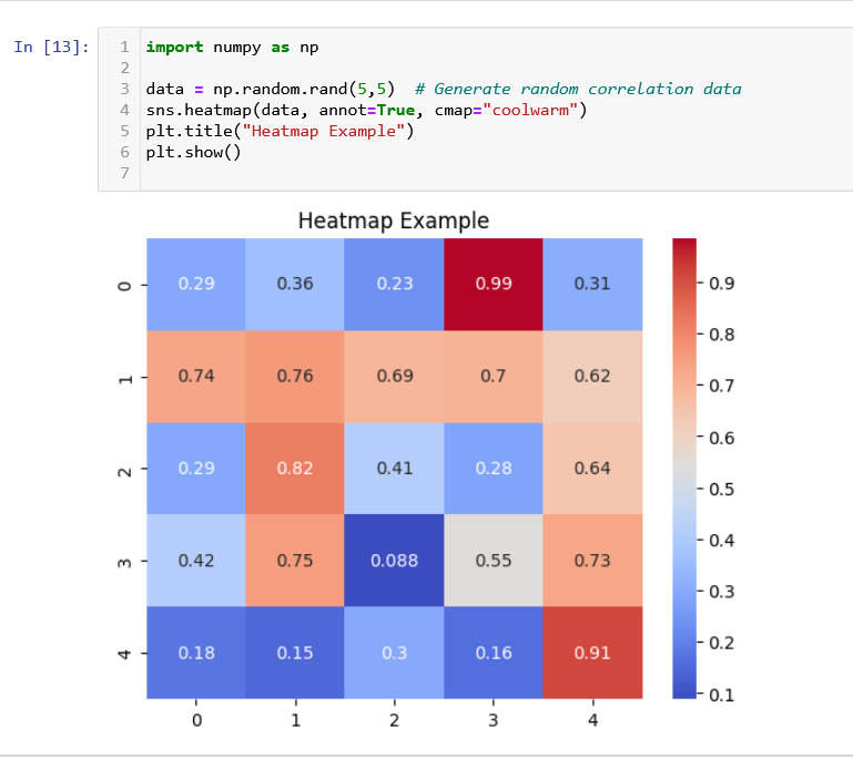
7️⃣ Heatmap (Correlation & Matrix Data)
Best for: Finding patterns in a matrix
Example: Correlation between features in a dataset, sales by region & product
Python Example (Seaborn):
Useful for feature selection and understanding relationships
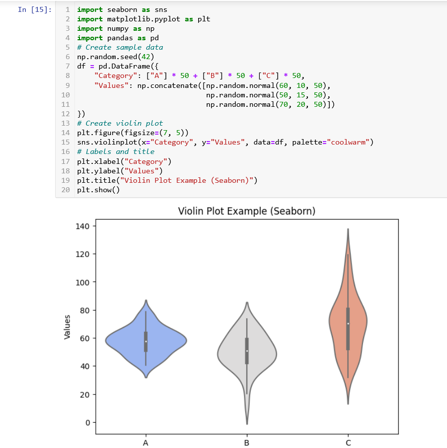
8️⃣ Violin Plot (Advanced Distribution Analysis)
Best for: Showing data distribution and density
Example: Exam scores across multiple classes
Python Example:
Combines box plot and KDE (Kernel Density Estimation)
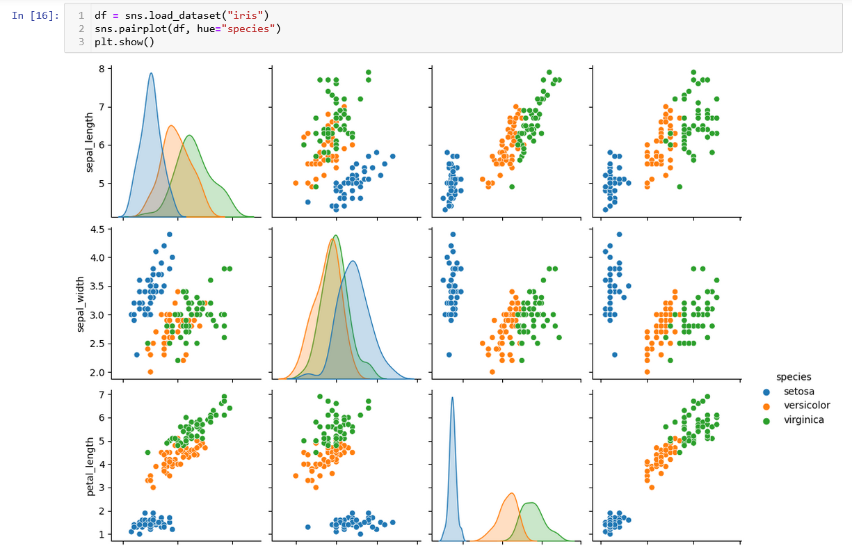
9️⃣ Pair Plot (Multi-Variable Scatter Plots)
Best for: Comparing multiple numerical variables
Example: Comparing height, weight, and age in a dataset
Python Example:
Best for exploratory data analysis (EDA)
Choosing the Right Graph