Introduction
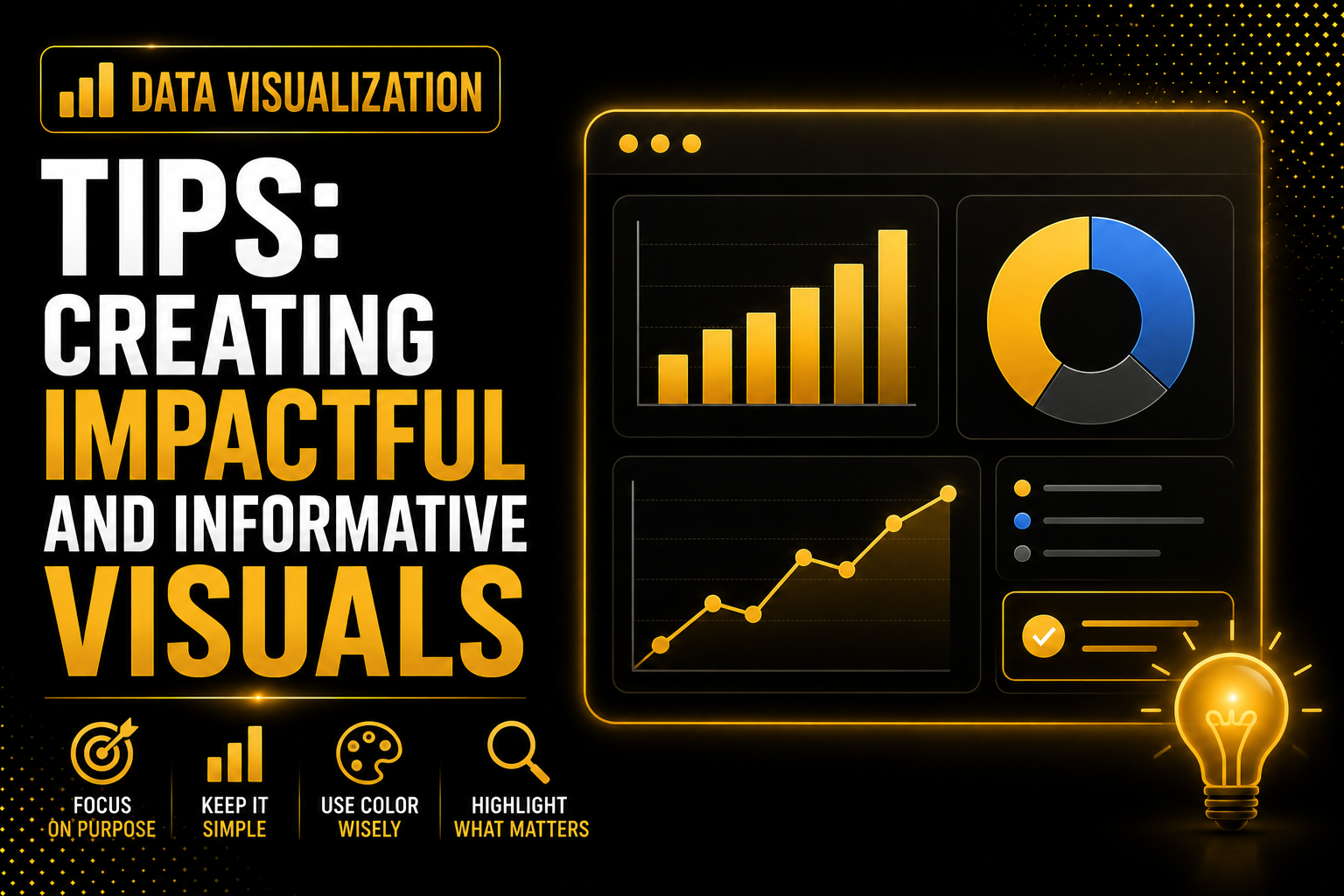
In this article, I am going to discuss about steps or tips to Improve your data visualization prowess with expert tips and techniques. This all-inclusive blog post provides invaluable guidance on choosing the appropriate charts, color schemes, and design principles to craft compelling visualizations. Discover how to present data in a lucid and captivating manner, transforming your visuals into potent tools for decision-making and impactful storytelling.
Note : If you want to understand about Data and its types please read our previous articles.
Understand Your Data and Audience :
Before diving into data visualization, it’s essential to understand your data and the audience you’re targeting. Recognize the type of data you’re working with (numerical, categorical, temporal, etc.) to choose the appropriate visualization techniques. Additionally, consider the knowledge level and preferences of your audience to craft visuals that resonate with them.
Choose the Right Visualization Type :
Selecting the right visualization type is crucial to effectively communicate your data’s story. Explore various chart types such as bar charts, line charts, pie charts, scatter plots, and heatmaps. Match the visualization type with the data attributes and the message you want to convey. For example :
Bar Charts:
- Use bar charts to compare categorical data, such as sales figures for different products or performance metrics for different teams.
- Display survey responses by categories, like customer satisfaction levels for different products.
Keep it Simple and Uncluttered :
Simplicity is key to impactful data visualizations. Avoid clutter and unnecessary elements that can distract from the main message. Focus on highlighting the most critical data points and ensure that the visualizations are easy to understand at a glance.
Utilize Color Thoughtfully :
Color can enhance the visual appeal of your charts, but it should be used thoughtfully. Ensure that the color choices align with the data being represented and avoid using too many colors that might confuse the audience. Use color to highlight important data points and create a visually pleasing experience.
Provide Context and Annotations :
Context and annotations are essential to help your audience interpret the data accurately. Include clear labels, titles, and captions to provide context to the visualizations. Annotations can draw attention to specific data points, trends, or events, making the visuals more informative.
Make Your Visualizations Interactive :
Interactive visualizations offer an engaging experience for your audience. Incorporate interactivity, such as tooltips, filters, and drill-down options, to allow users to explore the data on their terms. Interactive elements empower users to derive deeper insights from your visualizations.
Incorporate Data Storytelling :
Data storytelling is an essential aspect of data visualization. It goes beyond mere presentation, crafting a captivating narrative with your visuals. By arranging your visualizations in a logical sequence, you guide your audience through the data’s insights and conclusions. Take them on a journey, leading them to discoveries and understanding. Use clear labels and annotations to provide context, drawing attention to key data points. Engage your audience with a cohesive and meaningful storyline that highlights trends, patterns, and correlations. Effective data storytelling enhances the impact of your visualizations, making them a powerful tool for decision-making and fostering a deeper connection with your data.
Test and Iterate :
Testing and iterating your data visualizations are crucial for ensuring their effectiveness. Gather feedback from your audience or peers and use it to refine and improve your visuals. Continuously iterate and update your visualizations based on new data or changing requirements.
Conclusion:
Data visualization is a powerful tool for unlocking insights and communicating complex information with ease. By following these big data visualization tips and techniques, you can create impactful and informative visuals that enable better decision-making and deeper understanding of your data. Master the art of data visualization and make your data-driven stories shine.
Useful Resources:
- Python Playlist
- AI Career Path in 2025
- Machine Learning
- Learn Statistic
- Learn Data Visualization
- Data Analyst Interview Preparation Guide